[Packaging Design Concept]
Product: Noodle snack
Product name: Mì BIM BIM
Manufacture/Corporate: OTOKI VIET NAM
Product Launch Location: Vietnam
Scope: Concept | Art Direction | Design
Sector: FMCG Foods - Instant Noodles
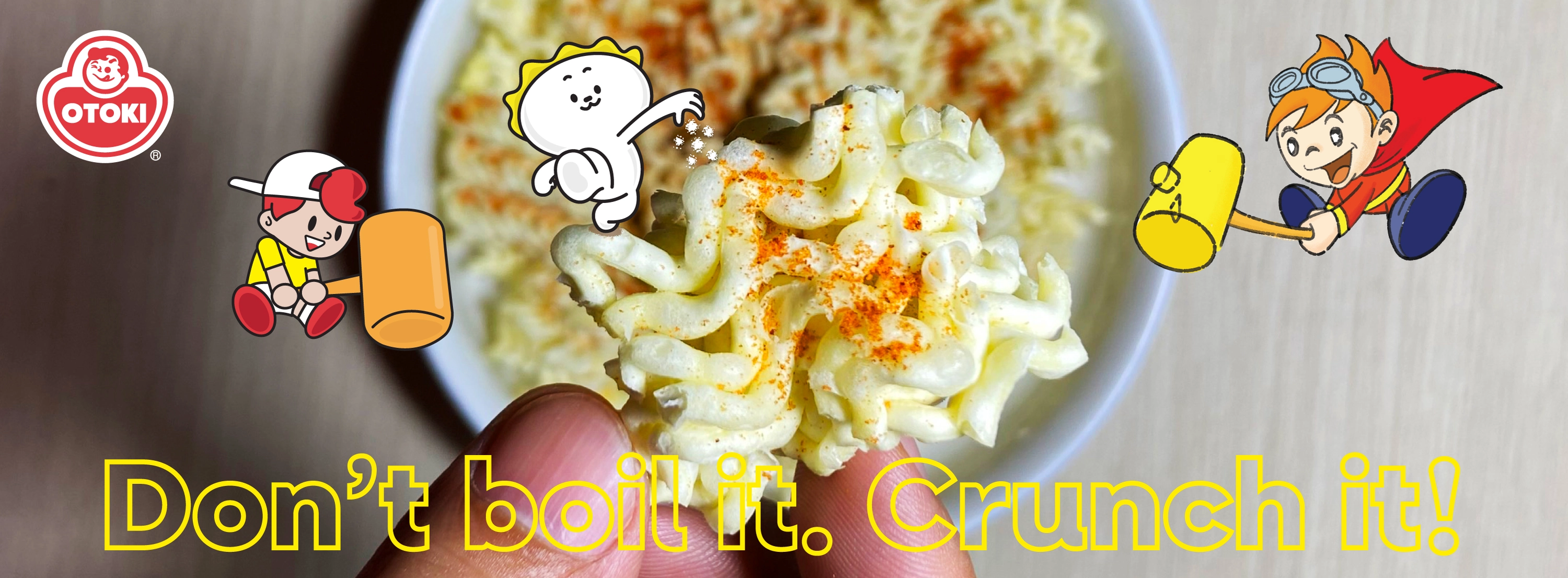
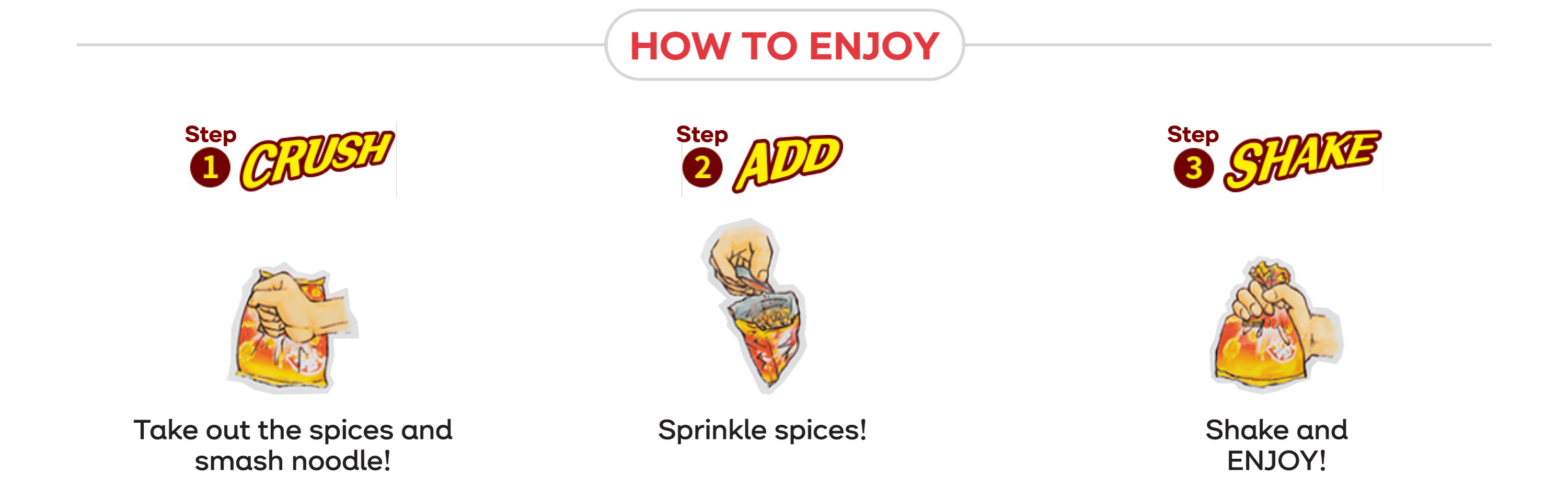
BIM BIM Noodle Snack is a unique and crunchy instant noodle snack that you don’t need to cook! Just crush the noodles, add the seasoning, shake it up, and enjoy the explosion of bold flavors. It’s a fun and interactive snack loved by kids and adults alike!

Target Audience: Kids, teens, young adults
Visual Style: Comic/Manga inspiration, cartoon character, bold colors
Design Strategy: Emphasizes fun and energy
Design Impact:
• The design clearly targets younger consumers: kids, teens, or even young adults who enjoy quirky, energetic branding.
• Positions the snack as casual, fun, and lighthearted, not serious or premium.
• Telling less about the product itself and more about the experience of eating it.
• Color palettes are often associated with excitement, appetite, and warmth. Make the package pop on a shelf.
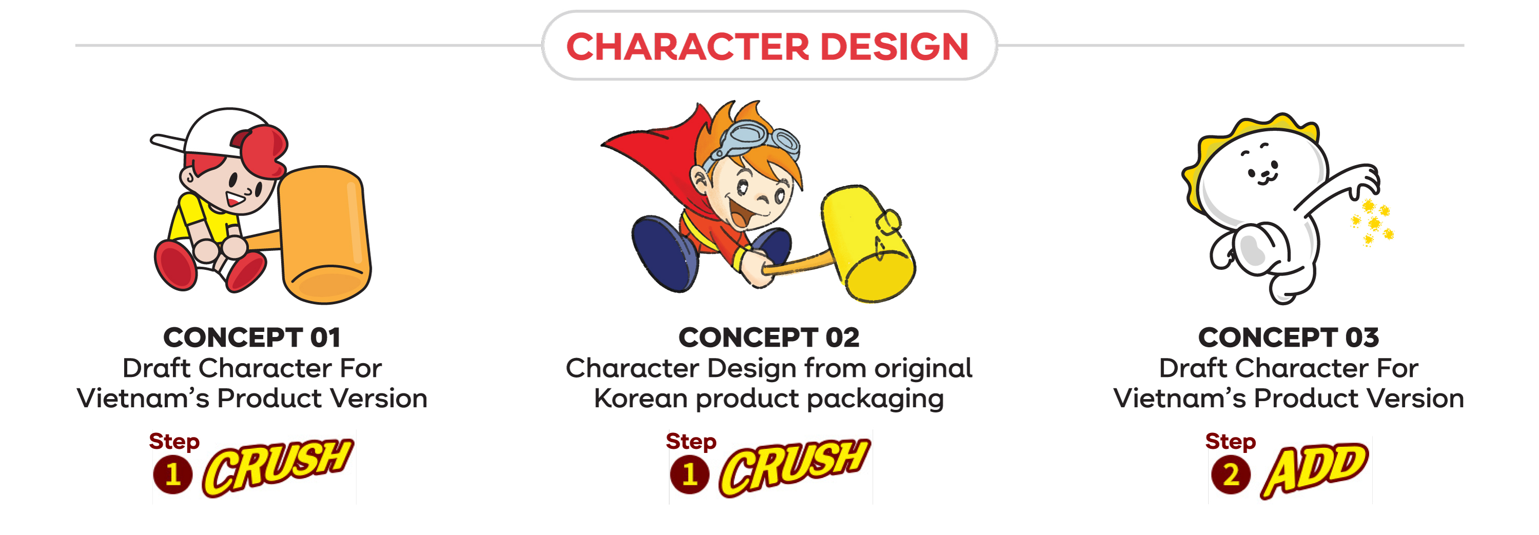

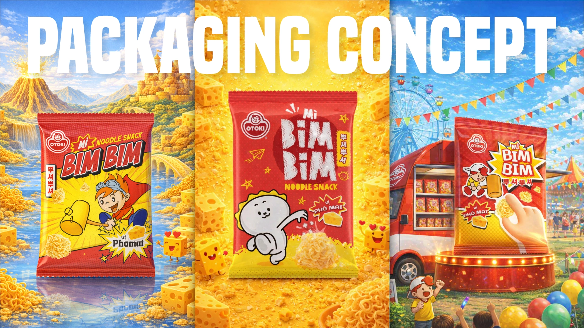
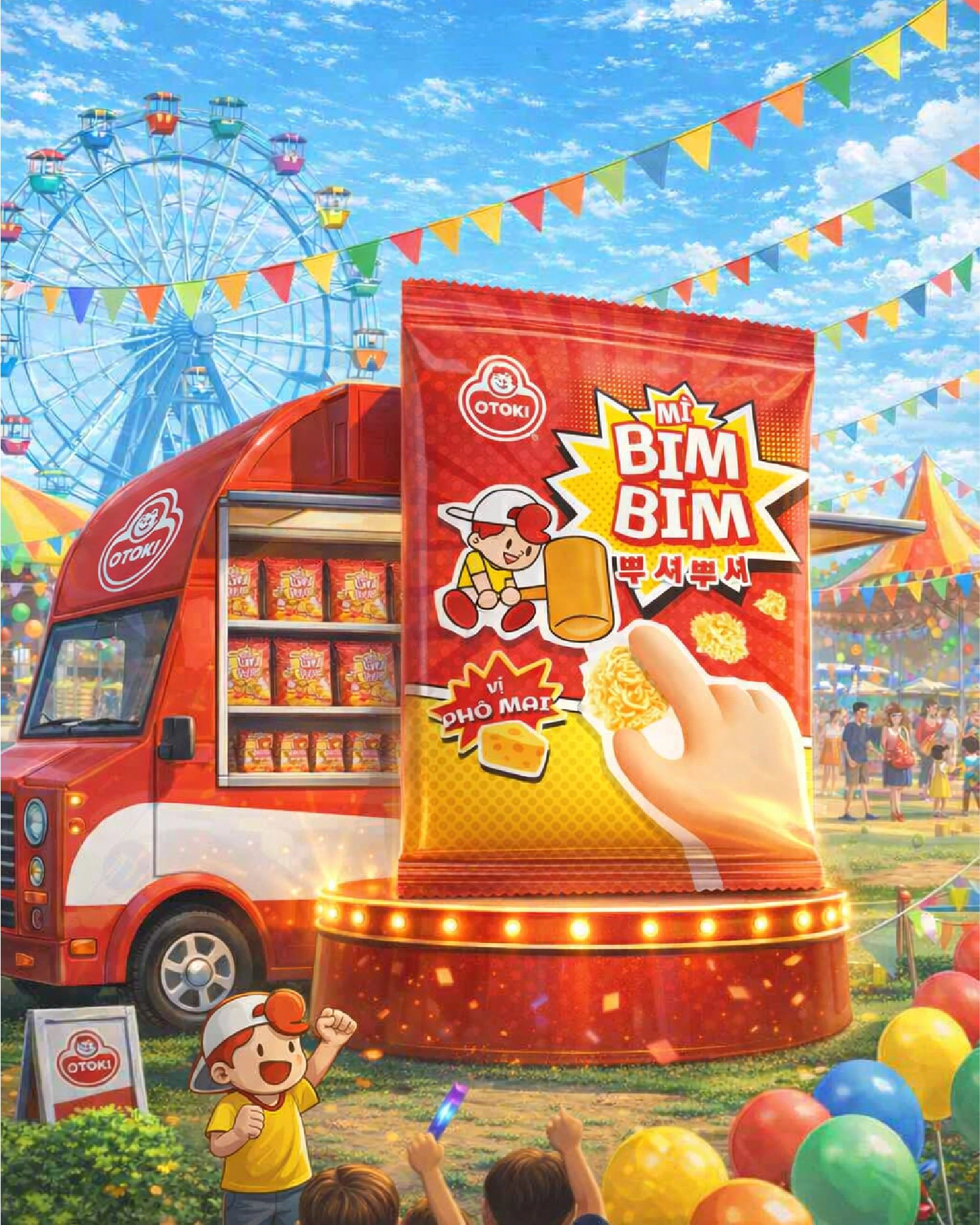
Concept 01 – Challenge Accepted
A Manga-book-inspired design with a layout like a manga panel gives it a fun, energetic vibe. The main character, wielding a mallet, is ready to face the challenges ahead

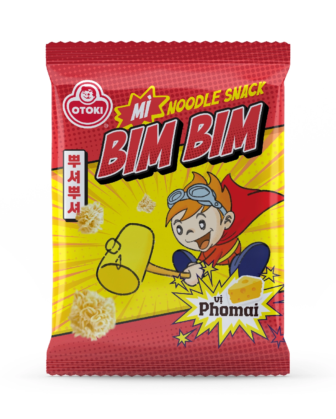
Concept 02 – The explorer
A Comic-book-inspired design with typical typography for the product name. The main character, as the explorer on an expedition, discovers the precious crispy noodles in a mysterious land

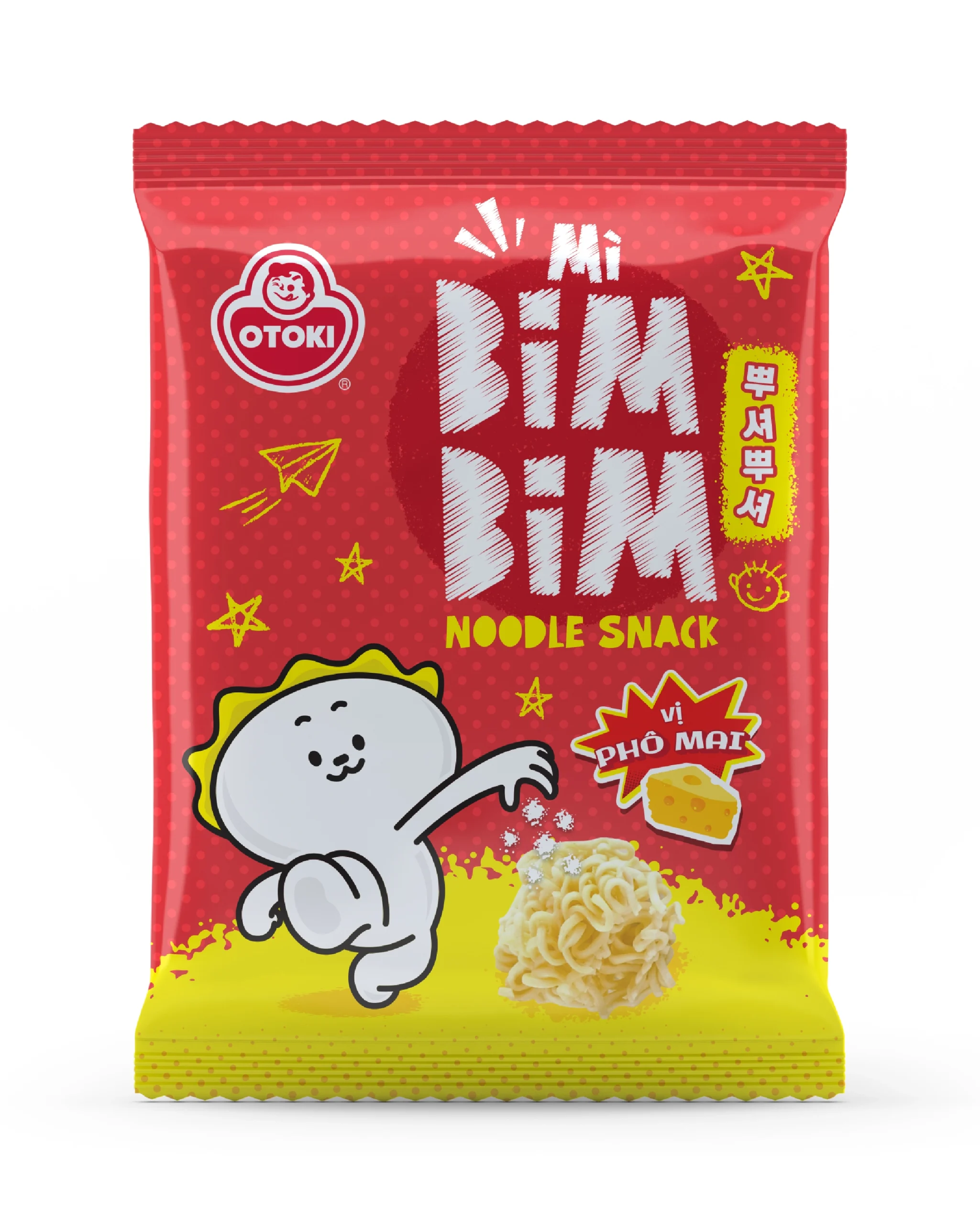
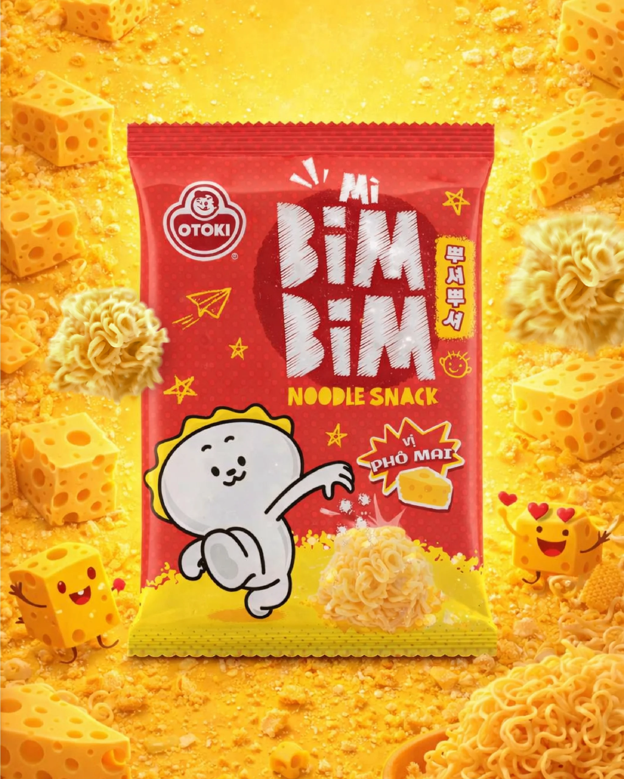
Concept 03 – The Spice Boy
The character sprinkling seasoning visually reinforces the step of the product experience, adds personality, and fun