Company: Otoki Vietnam | otoki.com
Brand: YEUL (열)
Product: YEUL (열) KIMCHI CAYYYY
Product Type: Spicy Korean-style instant noodles (Ramyeon)
Product Launch Location: Vietnam
Packaging Contents: Stable food products, asian noodle, bag type
Packaging Substrate/Materials: OPP/VMCPP
Mì Yeul Ramen (열라면) – Bản Gốc Cay Nồng Từ Hàn Quốc
(Yeul Ramen (열라면) Korean Packaging | Product since 1996)
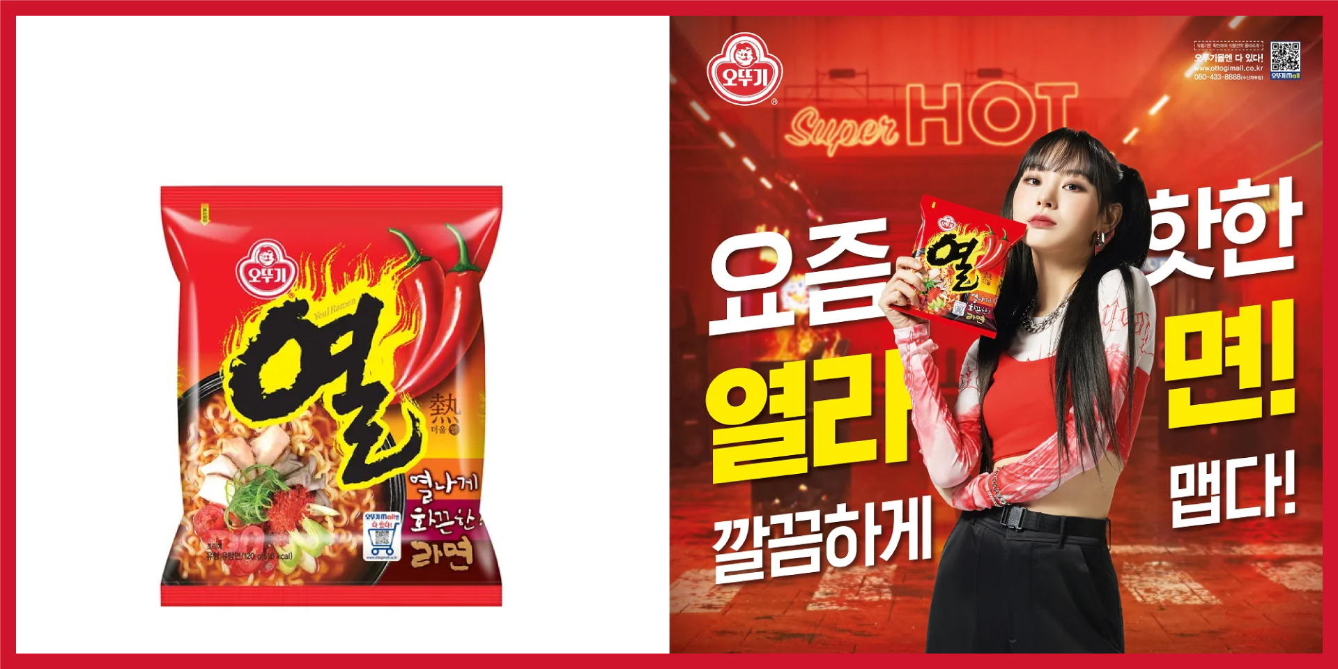
Mì Yeul Ramen (열라면) đến từ Hàn Quốc của thương hiệu OTOKI là sản phẩm quen thuộc đã ra đời từ năm 1969. Đây là dòng mì ăn liền phân khúc siêu cay vô cùng được ưa chuộng tại Hàn Quốc.
Từ “Yeul” (열) trong tiếng Hàn có nghĩa là “Nhiệt” hay “Sức nóng” – một cái tên nói lên tất cả về độ cay mà gói mì này mang lại.
Kế thừa di sản đó, tại thị trường Việt Nam, Mì Yeul Kimchi Cay – Một Phiên Bản Mở Rộng Đột Phá Từ Otoki Việt Nam ra đời, để tiếp cận gần hơn với khẩu vị người Việt nhưng vẫn giữ nguyên tinh thần “chuẩn Hàn”. Cay hơn, sâu và bùng nổ, kích thích vị giác ngay từ ngụm súp đầu tiên.
The first product’s name from Vietnam:
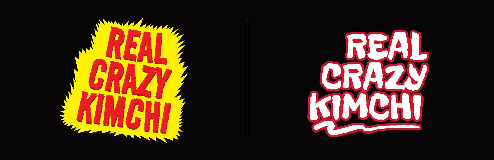
MÌ YEUL (열) REAL CRAZY KIMCHI
Unique Selling Point
Super Spicy (Rất cay) x Big Kimchi (miếng kimchi lớn)
Graphic Style Direction: Maximalism
Spicy Appeal | Flavor Authenticity | Bold Messaging
* * * *
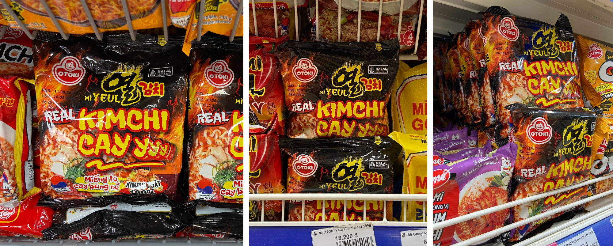
The black background with fiery red and orange flames immediately signals heat and intensity, black conveys boldness, while flames make the spiciness feel almost dangerous, which excites consumers looking for a challenge. The Product Name screams “EXPLOSIVELY SPICYYY KIMCHI” to make the eating experience sound thrilling. It’s not just food, it’s a fiery adventure. And the taste delivers exactly that – sharp, tangy, and fiery. It’s a straightforward promise.
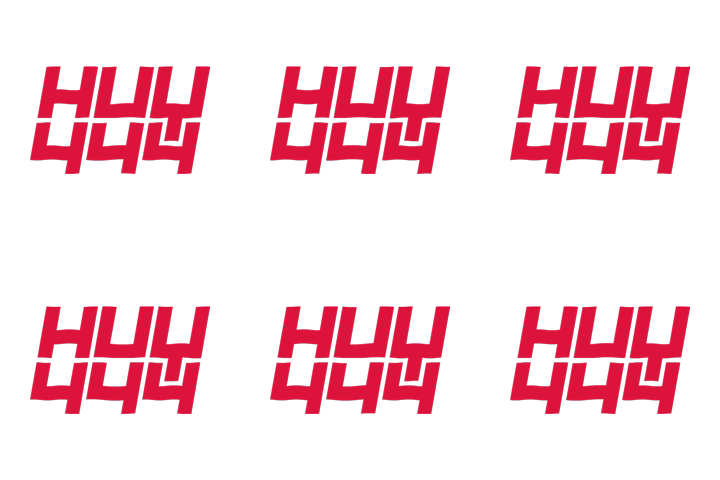
Two design directions for the product name
Full Packaging Design

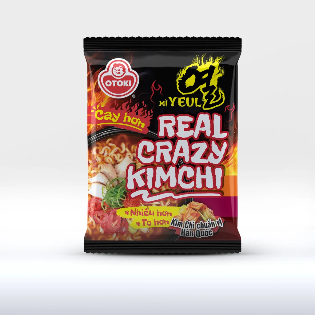
After the product name has changed:
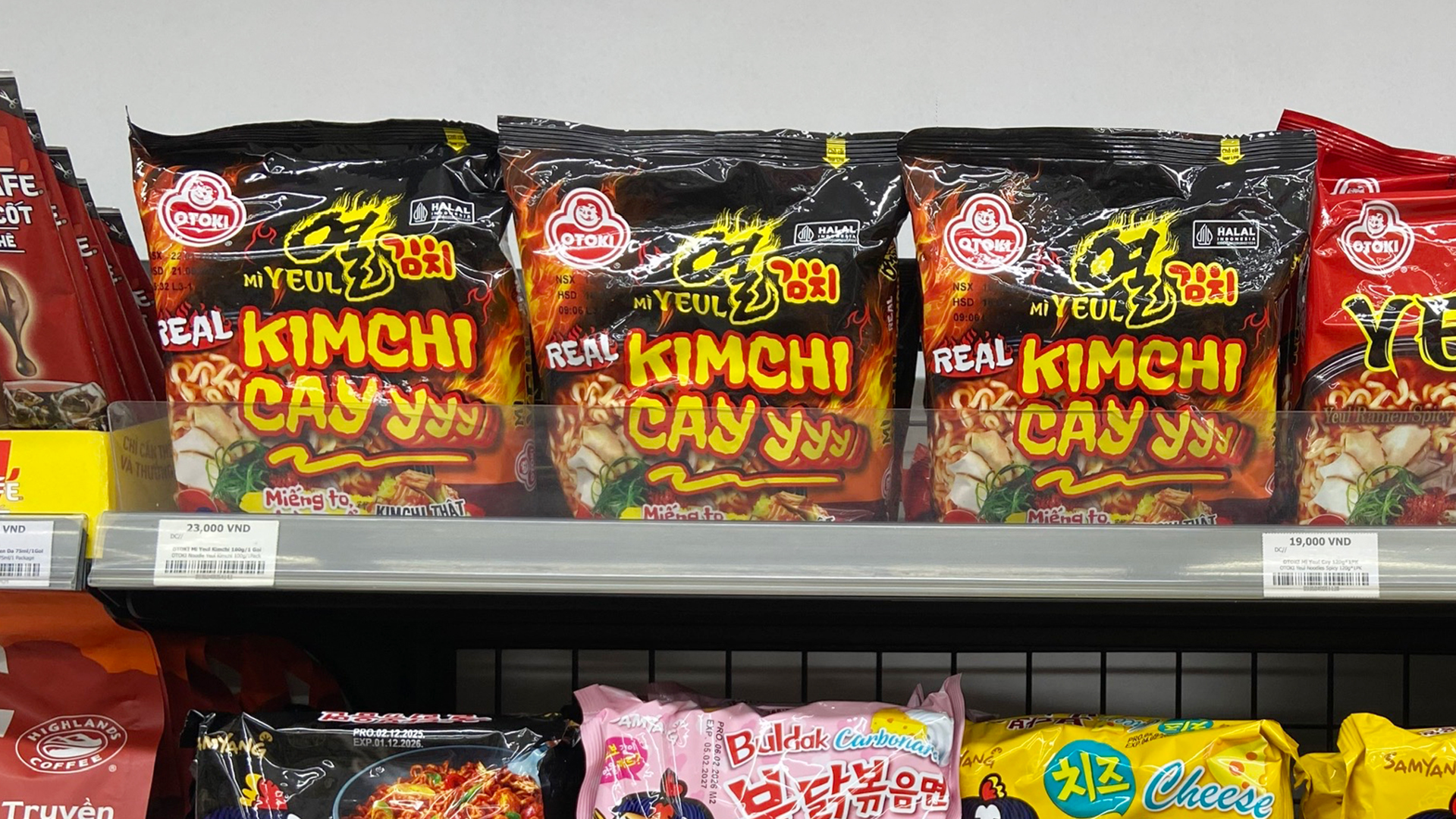
MÌ YEUL (열) KIMCHI CAY
Product Name Design

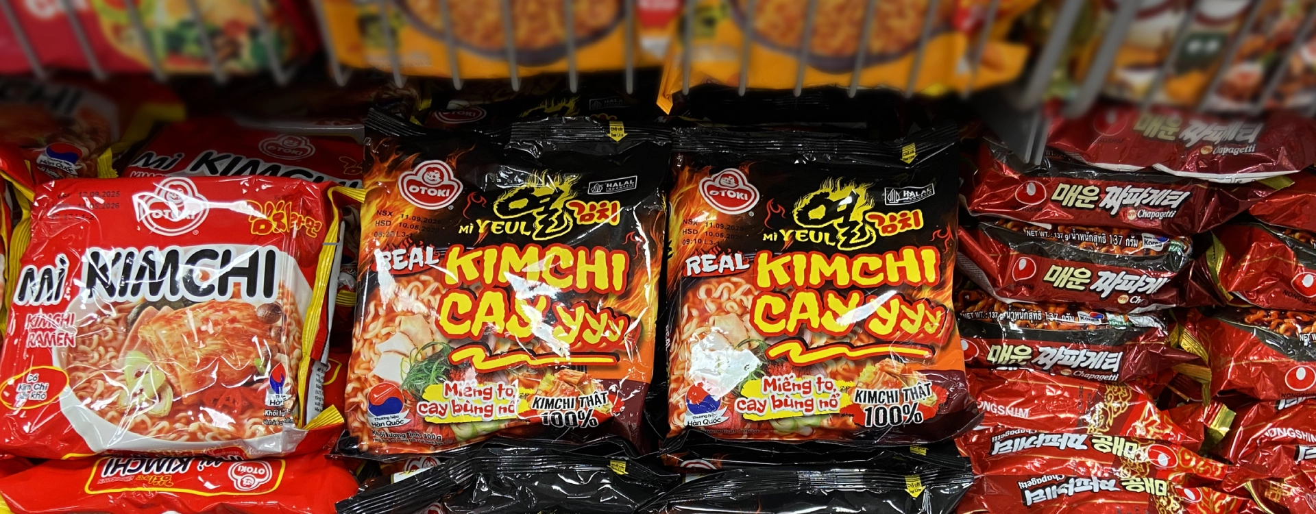
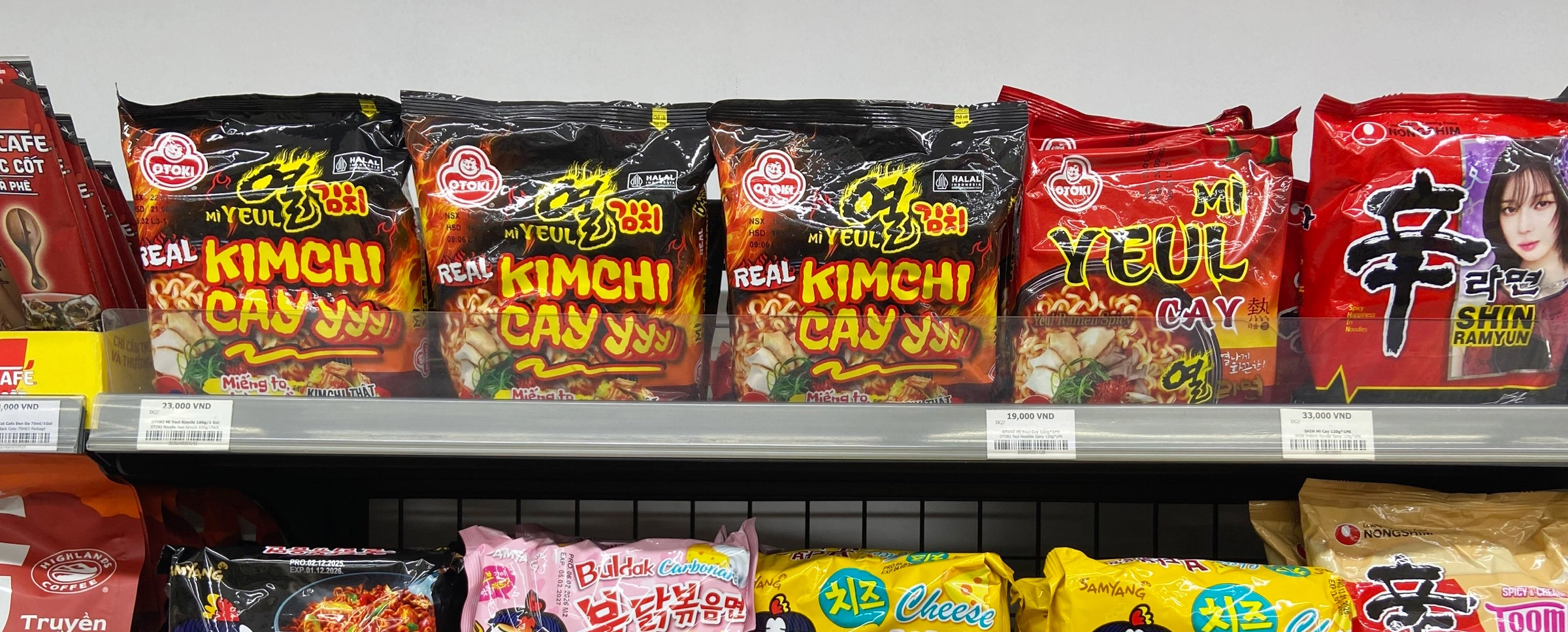
Final Product On Shelf